The first impression counts! It only takes a few seconds for the brain to make a judgment, and there is no second chance. For this reason, the home page is without a doubt one of the most important pages on a website. To a certain extent, it is a virtual entrance door for companies. If the visitors do not like what they see, they almost reflexively click on the “Back” button.
Unfortunately, there’s nothing to be done about it: Most people judge a website primarily by its design. Please note, graphic design within a website makes a good corporate identity.
But what distinguishes a good homepage design – apart from the text and content? Well, looks are not everything, the home page must also work well. That is why most of the examples of successful start pages on this list are not only visually convincing but also stand out, for example, through their cleverly used structure. However, any professional website design service provider in the USA can cope up with part of the design.
But before we get to the examples, let’s first review the home design best practices.
You will see that our examples more or less fully implement the following points. Of course, not all of the pages are 100% perfect, but the designs listed here definitely get pretty much done right. Here are the most important elements of a great homepage:
Renowned brands or well-known companies (e.g., Coca-Cola) can of course save themselves such a declaration. But most companies should adhere to this rule so that visitors know if they are at the “right address”. The best Website Design service providers know what to do in such situations.
Steve Krug sums it up in his bestseller “Don’t make me think! Web Usability: The Intuitive Web” summarized as follows: If visitors do not recognize within seconds what your company is actually doing, then they will not stay on your website for long.
A homepage needs to be clearly focused and address the right people in their respective language. The best start pages forego technical gossip and don’t just talk about the bush.
When visitors land on your homepage, they need an incentive to stay. You must see that the site is well worth browsing further. The home page is the best place for the value proposition. Otherwise, there is a risk that potential customers will quickly leave your website and move on to the competitors.
All of the home pages listed here are extremely user-friendly. That means: the navigation is simple and there are no “distracting” things like blinking banners, animations, pop-ups, or complicated, unnecessary elements that interfere with browsing. Many of these sites are also optimized for mobile devices, which is an absolute must in the modern mobile world.
All of the home pages listed here effectively use primary and secondary calls-to-action to direct visitors to the next logical step. Examples of this are “Free Trial,” “Schedule Demo”, “Buy Now” or “Learn More”.
Don’t forget the goal of your homepage: you want visitors to be incentivized to click through your website and further guided through the marketing funnel. CTAs alert visitors to what to do next. This way you can avoid being overwhelmed or not knowing what to do next. Calls-to-action on your homepage is not just a nice accessory, they also boost your sales and lead generation. Website design service providers are conscious of these aspects and carefully use tools to gear up the CTAs.
The best homepage isn’t always static. There are home pages – for example, Whitehouse.gov – that are constantly changing to respond to current needs, problems, and questions from visitors. Some home pages also change due to A / B testing or dynamic content.
A well-designed page is important to build trust, convey the added value, and guide visitors to the next step. Website service providers know that how home pages effectively use a wide variety of elements and criteria that are all coordinated with one another, e.g., B. layout, CTA placement, whitespace, colors, fonts, and much more.
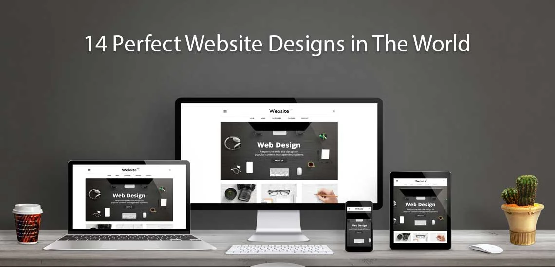
So now we come to our 16 examples of excellent home pages from real companies.
This homepage has a beautiful design. Particularly noteworthy are the skillful use of whitespace, the contrasting colors and the customer-oriented design.
The headline is clear and engaging, as is the calls-to-action.
The structure of the information hierarchy is particularly impressive. This allows visitors to quickly skim the page and immediately know what the company is about.
Visitors are not overwhelmed. There is a lot of discussion about what is better now: short, concise formulations or long and extensive pages with lots of information. Should you opt for the long variant, you need to ensure that visitors can easily scroll the page and read the content – this is exactly what this website can do.
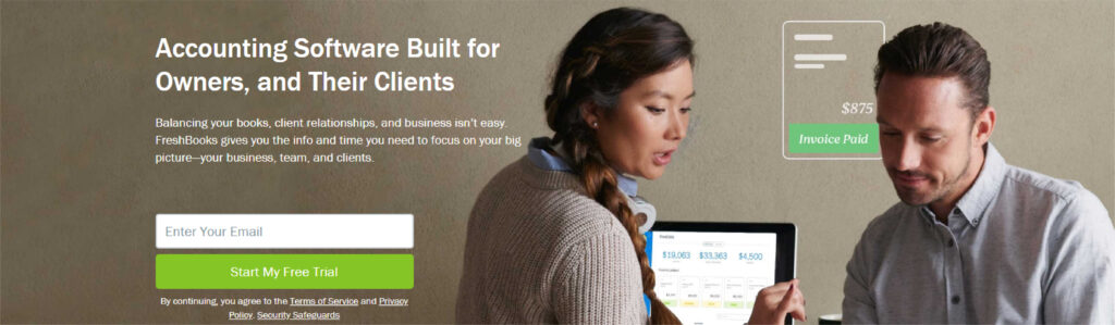
The website works with a clear structure and division and primary calls-to-action. It is immediately apparent that the company wants to attract visitors as leads.
The text “Try it Free for 30 Days” used in the calls-to-action is short, concise, and, above all, tempting.
The subheadings are also significant: They encourage visitors to easily send invoices with FreshBooks, to automate time-consuming tasks, and to track their own time expenditure. In addition, it is explicitly discussed how intuitive the FreshBooks software is, which benefits freelancers and small businesses (i.e., the target group of FreshBooks).
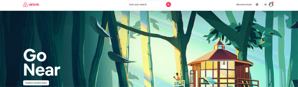
The start page is beautiful in and of itself: the visitor is greeted with a banner (rotator) that takes up the entire screen. The images that customers show on their trips booked through Airbnb and on various of the available journeys of the discovery appear very personal and authentic.
A search form for the travel destination and date is displayed directly, which leads visitors to the next logical step.
By the way, the search form is “smart”, i. H. it is automatically filled in with the last search query from users when they are logged in.
The primary call-to-action (“search”) is highlighted in color against the background. And the secondary call-to-action for hosts is also displayed in the directly visible area.
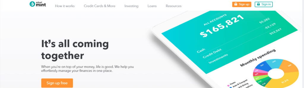
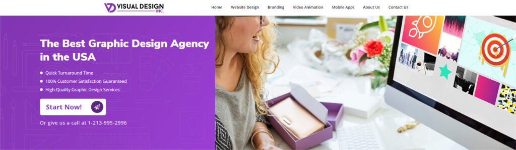
Website design service provider has kept the home page very simple, with a strong heading and subheading that do not require any technical jargon.
It conveys a safe but relaxed atmosphere, which is especially important for a product for managing financial data.
In addition, the text of the call-to-action on the page is simple, direct, and appealing: “Sign up free”. The CTA design is also brilliant because the locked lock subtly points out the security aspect.
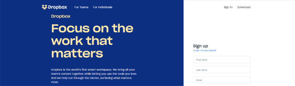
The Dropbox home and website are the ultimate examples of simple, working design. Instead of using a lot of text and visual elements unnecessarily, a lot of whitespaces is used here.
There is also an animated graphic that immediately catches the eye (unfortunately, this cannot be seen so well on the static screenshot above).
The subheading is also kept simple, but it works: “Access all your files regardless of location or device and share them with anyone.” You don’t have to decipher what Dropbox is doing first.
The focus is on the primary call-to-action “Register for free”. And the option to register via Google is perfect for all visitors who don’t like filling out long registration forms – particularly a job of website design service provider.
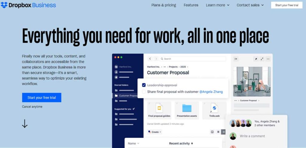
Dropbox provides a great example of different website designs, each aimed at different audiences. In contrast to the main start page, which was originally developed for end-fusers (see example above), business users want more information and additional evidence that Dropbox for Business is a secure and scalable solution for companies (Dropbox also addresses this point directly on the start page).
Dropbox relies on a simple design and branding here too. Only the most important elements are available: a large, relevant picture with supporting text and a call-to-action button “Try 30 days for free”.
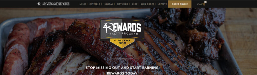
It makes your mouth water! At least if you are not a vegetarian. In combination with the video, the headline “Brisket. 18 years to master. Yours to savor. ”(For example:“ Brisket – matured for 18 years for your enjoyment. ”) You really want an experience that you definitely shouldn’t miss.
The parallax effect when scrolling cleverly guides visitors through the website: They receive information about the services and the menu and see photos of people having fun. Parallaxes are currently a popular design trend and are implemented excellently here.
The only negative point? The restaurant is far too far from where I live. Pity!
Headline and subheading immediately address the emotional side of the visitor: “Work With a Company That Gets It” (Contact an experienced company.); “Trust us. We’ve been there too! We’ll find jobs where you can thrive. “(Trust us! We know what it is like. We’ll find a job for you that you can thrive!”) The value proposition is unique and enticing.
It’s hard to see in the screenshot above, but the heading rotates and is aimed at different audiences – from job seekers to people who want to find a therapist for their school.
Visitors have various navigation options and the calls-to-action help to find their way around the page (because they are well-positioned, use simple text, and stand out from the rest of the page in terms of color).
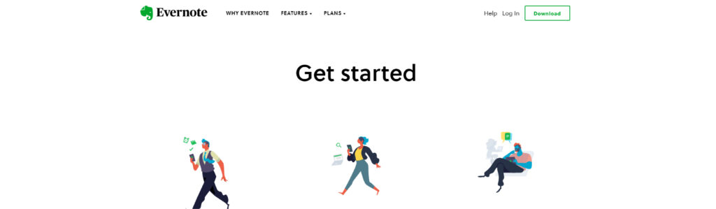
Over the years Evernote has grown from a simple note-taking app to a provider of enterprise products. Evernote does what other companies find difficult: to pack as many potential messages as possible into a few important sentences on the homepage.
This homepage uses a combination of strong, muted colors in the video and the brand color shade light green with white highlights to highlight conversion paths.
After a simple headline “Your virtual memory”, your gaze is immediately drawn to the call-to-action “Register for free”.
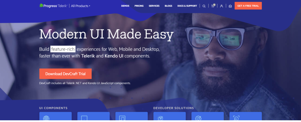
As a visitor to the Telerik homepage, despite a lot of information, you don’t have the feeling that you are overwhelmed. At this company, which offers a wide range of technology products, the bold colors, attractive designs and video elements are reminiscent of Google. Among other things, this aspect ensures that visitors feel welcome and know that they are dealing with real people.
The clear and uncomplicated presentation of the six product offers is particularly successful. It clearly shows what the company does and how visitors can get further information.
The text is loose and easy to read. This company speaks the language of its customers.
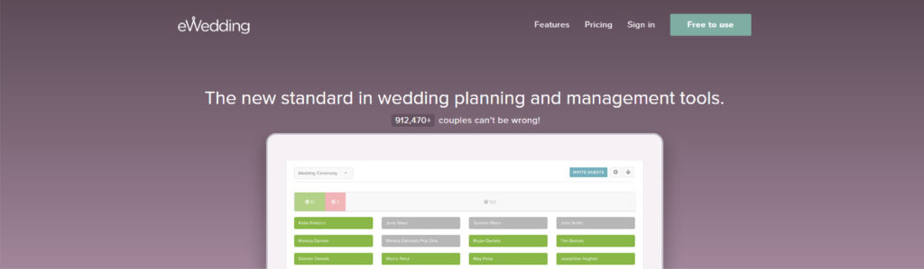
For all newlyweds planning their big day, eWedding is the best place to start your own wedding website. The homepage is not cluttered and only contains the necessary elements so that visitors can immediately start creating their own website.
The subheading “Over 800,000 wedding websites built!” is a great example of social proof.
In addition, great pictures, an appealing headline, and a call-to-action (“Start website”) have been added so that visitors do not lose sight of the actual goal – the creation of the wedding website.
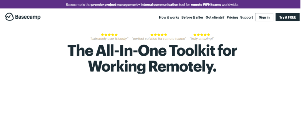
For a long time, Basecamp has stood for brilliant start pages. Here you can see for yourself why that is. There are often great headlines and clever comics on the homepage.
The call-to-action is also noticeable and is positioned in several places in and around the directly visible area.
In this example, the company chose a blog-style home page (or a single-page website), which is why there is a lot of information about the product there.
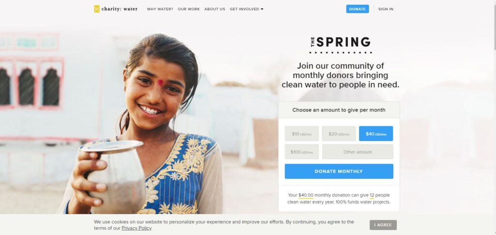
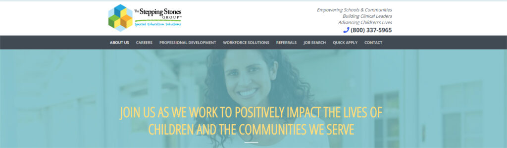
This website is far from typical of a nonprofit company. Lots of visual elements, creative texts and interactive web design ensure that this website stands out from the crowd.
Photos and videos are also used strategically. This is intended to address the emotional side of the visitor, which acts like a subtle call to action.
This homepage has a beautiful design. Particularly noteworthy are the skillful use of whitespace, the contrasting colors and the customer-oriented design.
The headline is clear and engaging, as is the calls-to-action.
The structure of the information hierarchy is particularly impressive. This allows visitors to quickly skim the page and immediately know what the company is about.
Get in touch with our customer service representatives and designers to ensure that your business is nothing less than a success.